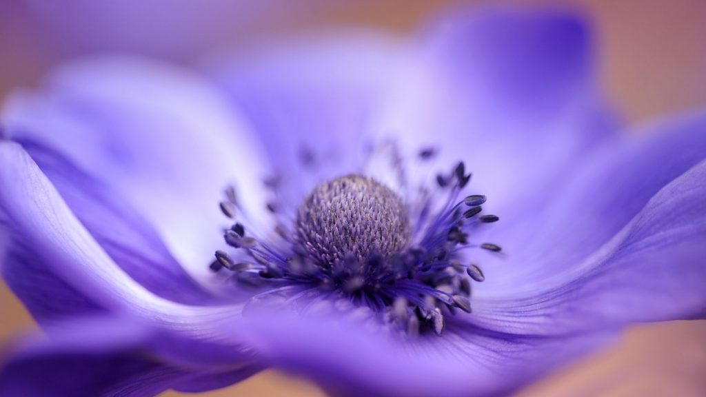
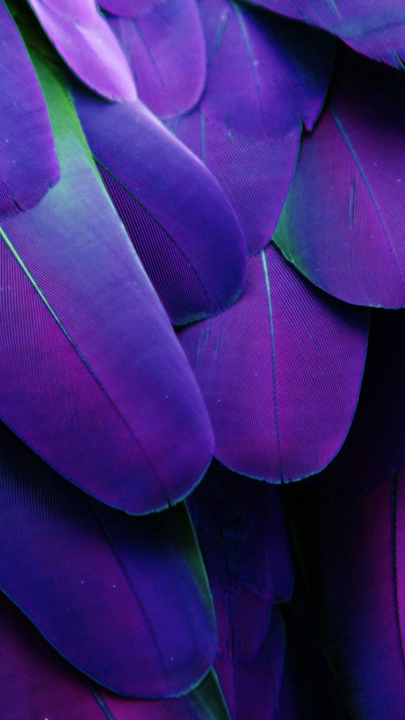
Very Perri is this year’s Pantone colour of the year 2022. A fitting tone for what feels like a mad mix of moods and sentiments we all seem to be twisted into currently.
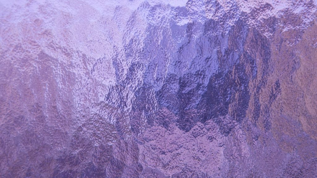
This rich blue fused with a vibrant rose undertone feels somewhere between calming lavender and the heat of a burning flame yet somehow balances between two beautifully depending on how and from where its lit.
Not often seen in nature or in home decor so we couldn’t help but get inspired by this unique gem. Its also cousin to purple the colour royalty and wealth, so how can we go wrong?
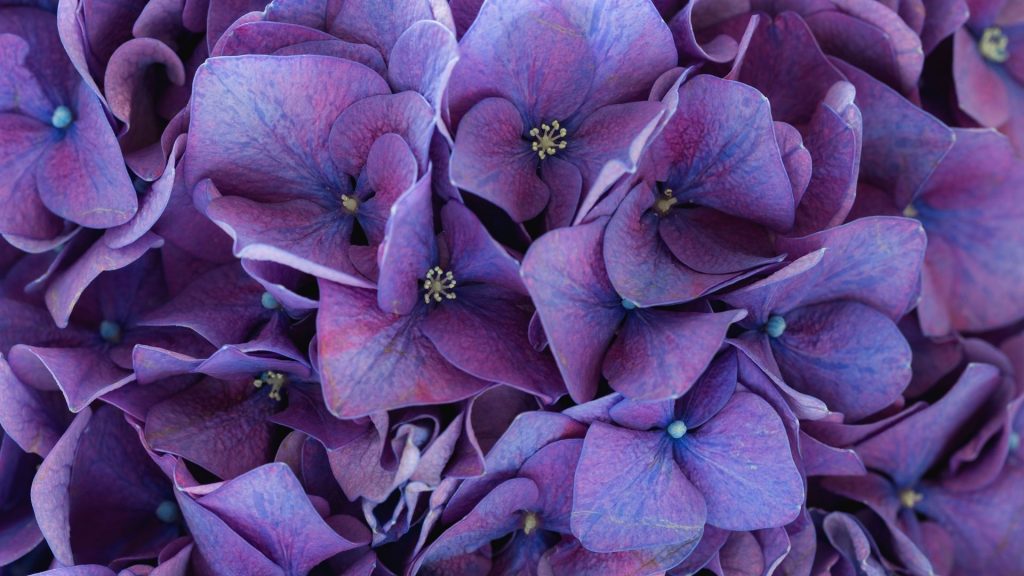
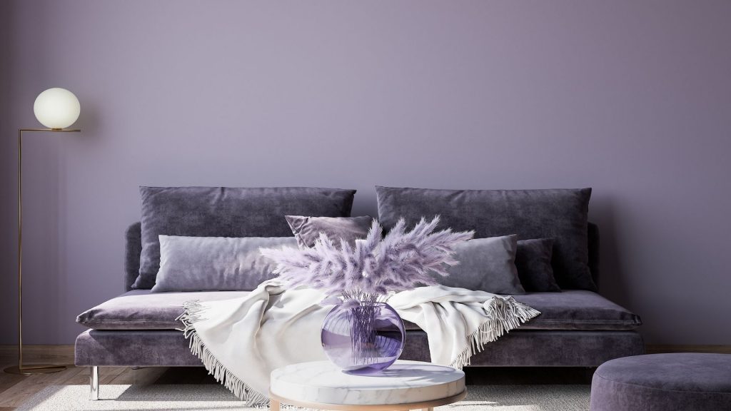
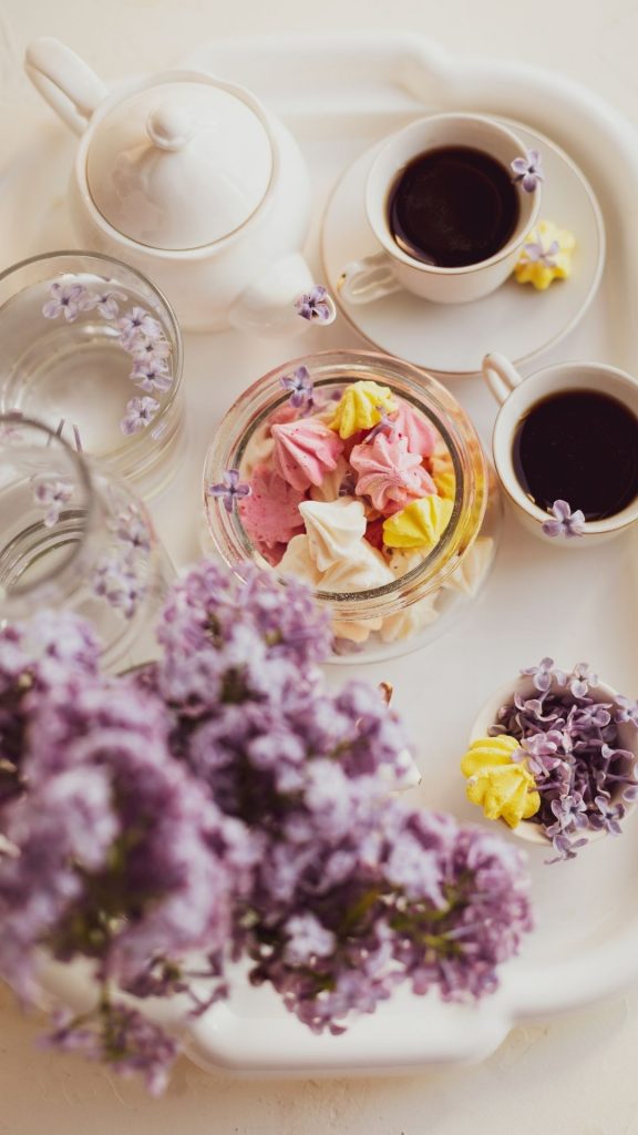
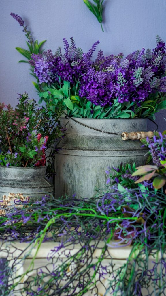
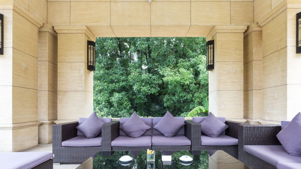
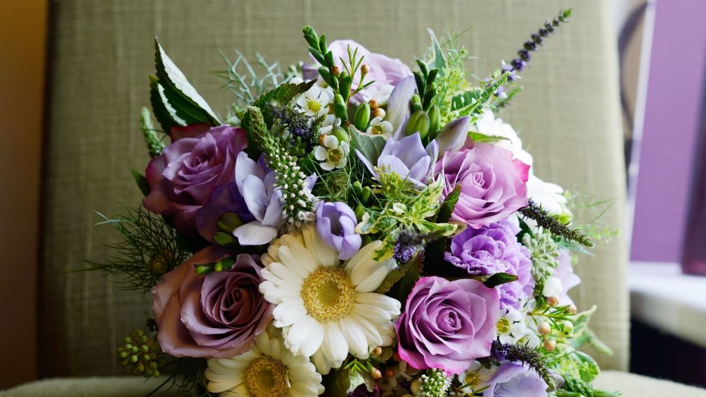
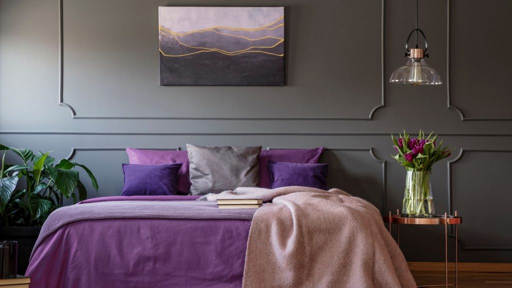
From the inspiration below we think you’ll agree this colour feels incredibly luxurious whether it’s layered with monochromatic walls, mixed textures, fresh florals, beautiful light or all of it together.
Very Perri and tones of purple make a stunning statement, and really don’t get the attention they deserve, but maybe its better to keep this a secret.
Very Perri Home Decor Inspiration
