Colours give us a unique visual perception to see, understand and communicate without needing to utter a single word.
This year Pantone’s 2021 colour choice seem to have captured the current sentiment perfectly. Ultimate Gray (17-5104), a mild-mannered grey much like the numb times we’re living at present with unending lockdowns. And Illuminating (13-0647) a warm yellow that gives us hope of a brilliant more ‘normal’ tomorrow.
Gray, although a cool and classic colour, is more sombre but provides a strong base for yellow to shine and radiate. A good reminder of the adage that we need some dark days to truly appreciate the bright.
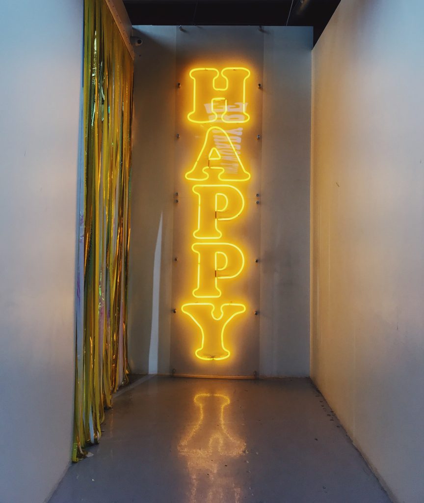
Yellow of course transmits warmth, vitality, good energy, health and the sun’s nourishing glow, and dare we say it – happiness. Yes, happiness. Not a word we hear much these days, but one we should imbue in our lives as much possible since positive energy is at the core of our mental and physical health.
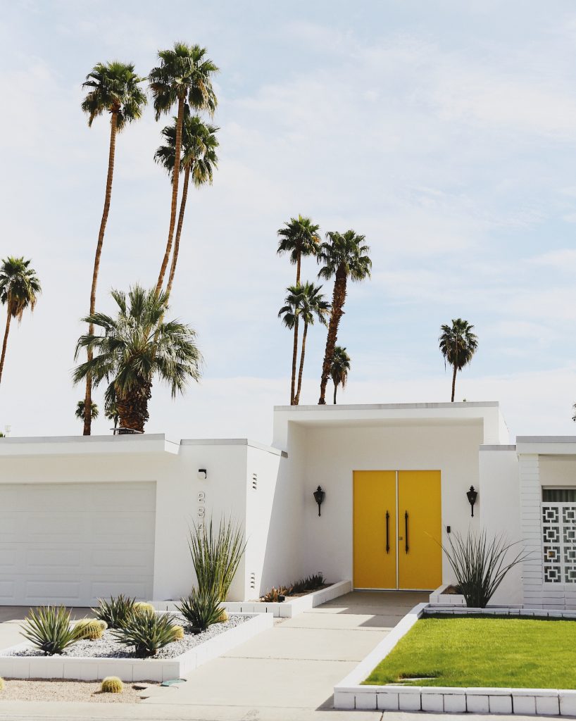
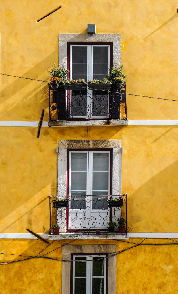
Inspired by Pantone’s 2021 colour combination we pulled a few images and ideas together from Portugal and elsewhere to remember where yellow is at work already, and where you could also add some ‘Illuminating’ energy into your home and life.
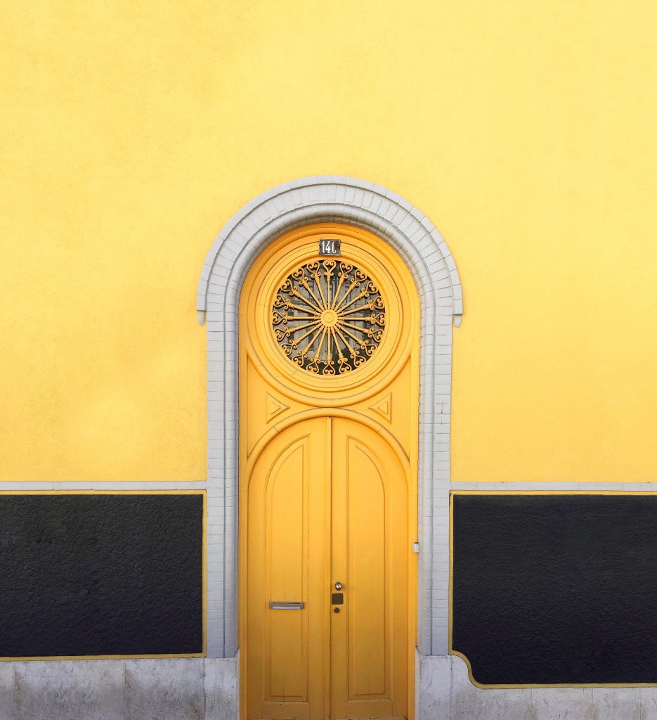
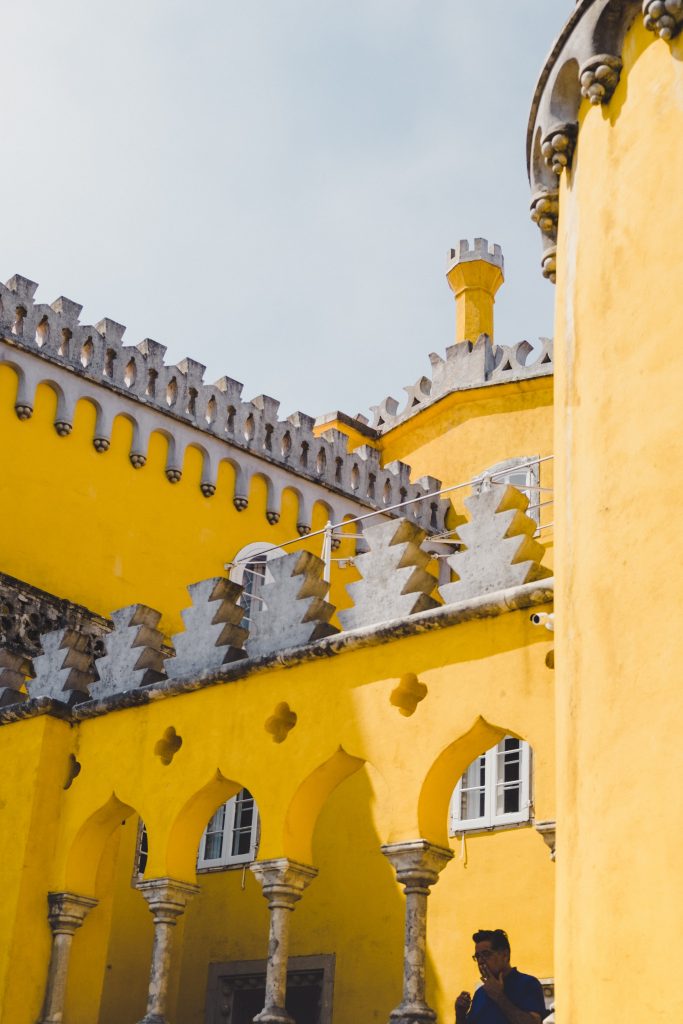
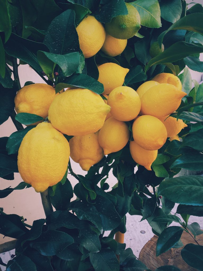
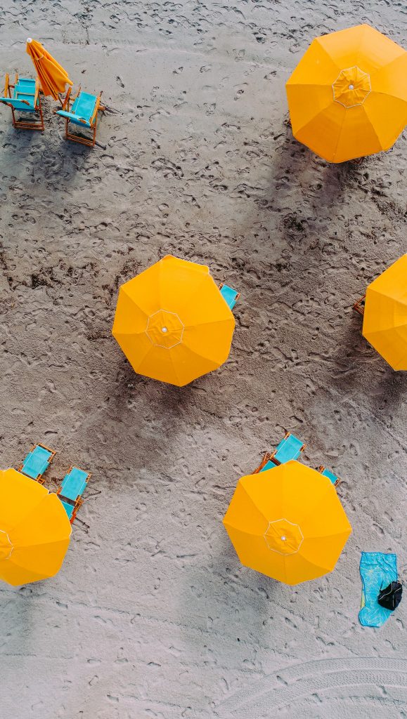
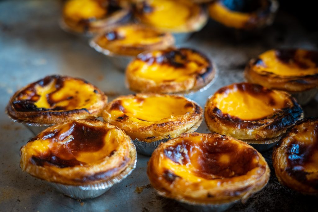
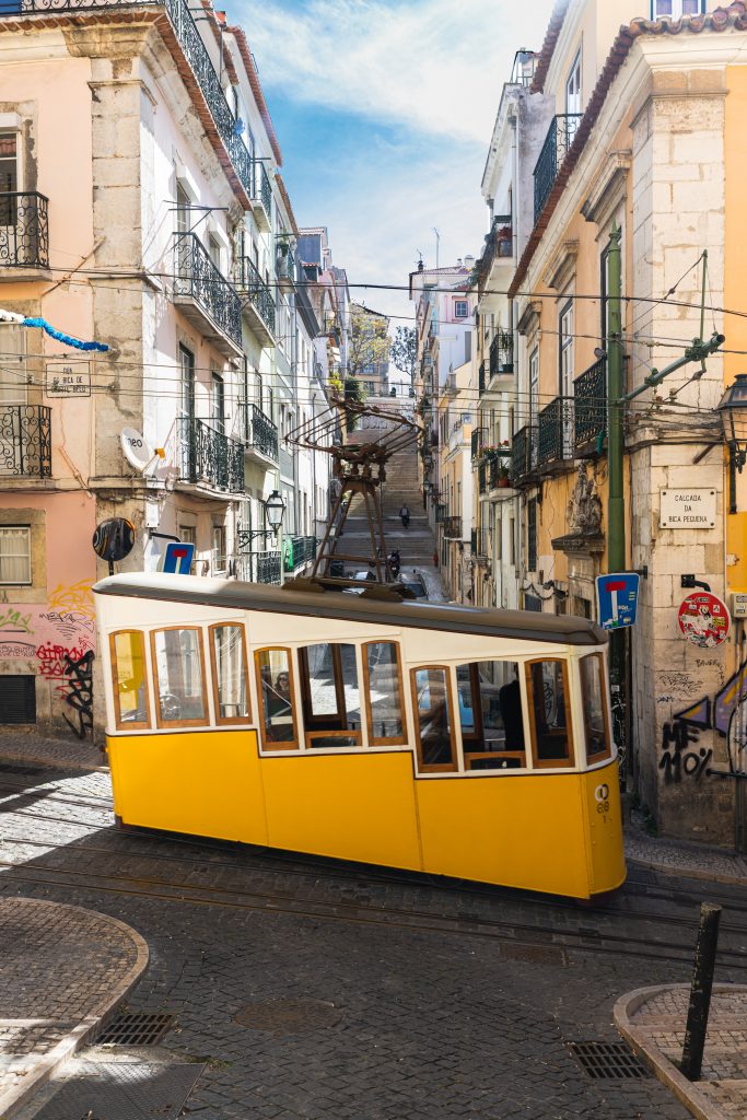
Wonderful rich yellows are found throughout architecture old and new, furniture, doors, umbrellas, fruit trees, gardens, window sills, Lisbon’s famous streetcars and of course the national favourite pasty – the pastel de Nata.
You can also add this happy colour in less committed doses such as cut flowers, lighting, throw pillows, rugs, art – or maybe even create your own.

